
Let’s face it, we have all been there, staring at paint tins in your local DIY shop and having absolutely no idea where to start. With so much on offer these days, how are we to know what colour to paint our conservatory walls?
There are hundreds of shades on the shelves just waiting to dazzle us until our brains are an overload of 42 shades of off-white and grabbing our phones to google the actual difference between a satin and semi-gloss.
I even have friends who were so sick of trying to find the ‘perfect’ shade for their living room, they simply chose the colour with most pleasant sounding name. Personally not something I would recommend! Although the colour isn’t exactly what they envisioned, it certainly makes a good talking point.
Here at Konservatory, we are here to help you get it right the first time. Too often conservatories are given up the right to be adventurous with different tones. We are exiling the eggshell, removing memory of magnolia and banishing beige to show you that conservatories can have as much personality as you do!
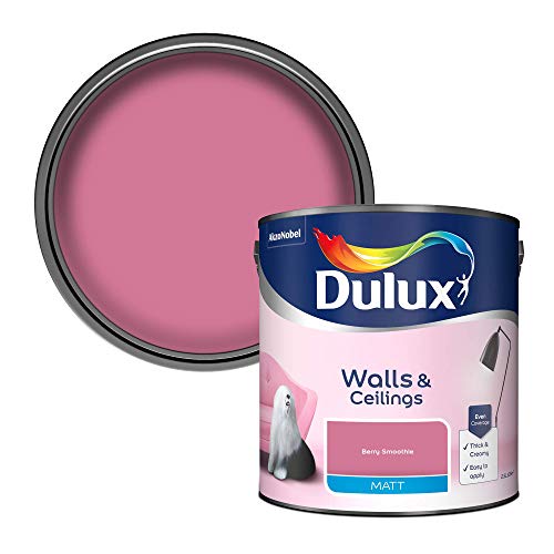
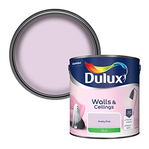
We’re a fan of lighter, less subtle colours, such as the ones below

It is time to make the most of your conservatory and give those neglected walls some much-needed charisma and flair! Why not check out our best conservatory chairs to complete the look as well.
Whilst we can’t tell you exactly what colour to choose, we hope this will give you a good basis to achieve that perfect style.
This Time, It’s Personal

Too often do people make choices to please others. We can become so preoccupied in keeping up appearances we can lose sight of what we really want. Just because a certain style is en vogue doesn’t mean you have to like it too.
Create a clear idea in your mind of what you want from your conservatory, the use, the mood and the overall atmosphere.
Do you want a tranquil escape to hide in with a book and a cuppa or will it be the central hub of your celebrations? Once this has been established, it should make it easier for you to start narrowing down certain shades.
Traditionally, blues are used for calm spaces and purples and indigos are associated with thoughtfulness and spirituality. Pinks are said to promote comfort and tenderness.
Orange supposedly helps to expand your thinking, if this is true then perhaps we should get the paint rollers in every office and student dorm room!
Yellow is said to increase focus and improve mental agility, excuse me while I paint every item I own like a banana! Bright red is unsurprisingly a stimulant but, used in moderation, is considered to increase self-confidence.
We can’t be positive if these theories are solid but perhaps there is some truth, personally I would feel more relaxed sitting in a strange blue room than that of bright red!
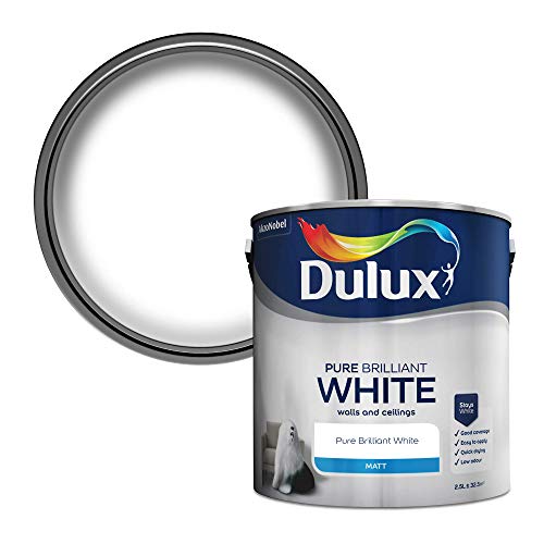
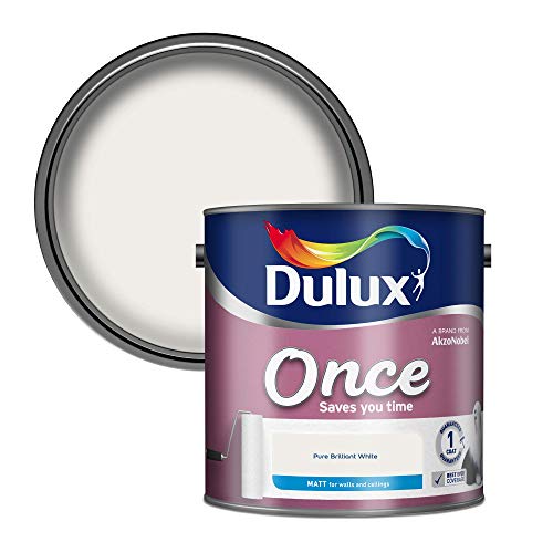
We’re also a huge fan of the sleek matt finish the Dulux Emulsion paint can offer. We’ve typically only needed one coat of it and found it tends to dry quickly as well. But it doesn’t have to be white, you can check out a range of colours here

We’re also a huge fan of the sleek matt finish the Dulux Emulsion paint can offer. We’ve typically only needed one coat of it and found it tends to dry quickly as well. But it doesn’t have to be white, you can check out a range of colours here
Take inspiration from your own style, whether that be your fashion, current furniture or even a favourite hobby. Don’t be afraid to inject your own identity, after all you will be enjoying the space more than your friends. There countless carbon copy conservatories out there, it’s time to put your stamp on it!
Themes – Trash or Triumph?

Done right, theming your conservatory can give it some real chic. As mentioned before, why not choose a favourite hobby to style it around? Or even a memory?
Perhaps you sail in your spare time, try a nautical theme. Maybe a previous holiday to Asia has left you envious of the orient?
This doesn’t have to be a monumental task either, a few token accessories chosen with complimenting colours can easily give the right vibe.
Do you have a certain painting or ornament that you have always adored but it needs a new lease of life? Consider moving this into your conservatory and making it a focal point by choosing a coordinating wall colour.
Bold or Muted?

Why not both? So many of us are worried about choosing a bold colour and causing our rooms to look gaudy. Similarly, there is the concern of choosing something muted and leaving a space looking stale.
So choose the best of both worlds! Make a bold feature wall and add elements of complimenting, more neutral tones.
You can pick up elements of the louder shade with accessories like cushions, photo frames and even conservatory plants.
If you can’t find a plant that matches your tone (or can’t commit to looking after one that does!) consider potting some in coloured pots instead.
Know your budget

Paint is generally the same price throughout a brand and does not vary between shades. However, what shade you do choose could tug on the purse strings later.
There is little use in choosing a colour that clashes with the items already in the room if you do not intend to replace these. Otherwise, you may be left with a some-what shattered vision and be no better off than you were before.
Of course, we couldn’t not mention your floor! If you are planning on keeping your current flooring then use a paint shade that works with it.
If you have a coloured carpet, keep in mind this can be reflected off pale walls. A subtle green may look ideal in your conservatory but your carpet or rug could compromise this and create an entire new tint.
If you are going for a full redecorate and changing your conservatory floor, try and make a decision on this first. Flooring is far more costly to modify and there is less of a variety than paint (especially with some stores offering to mix ANY shade you want). It will be easier to match your paint to your floor than vice versa.
Furthermore, consider the reality of how often your chosen shade would need to be changed (if at all). So many fashions can become dated quickly (the quicker we forget about avocado bathroom suits the better!) so if you are going to make a statement be prepared that this may not be appreciated in a decade.
If you have little ones, a crisp, light shade isn’t the most practical. Grubby hands and crayons seem to gravitate towards these walls. Of course, your youngster will have no recollection of how this happened.
You must be willing to accept that touch-ups here and there will be inevitable, keep a record of which shade you used so you can easily pick up another tin if needed.
Also, be prepared to invest in high quality paint, it may be tempting to reach for the massive bargain tubs but, if you can afford it, choose quality over quantity.
Cheaper paints tend not to have such good pigmentation and can often look a bit flat. The higher prices are typically harder-wearing too, therefore your new paint job will last much longer.
Let There Be Light

Quite possibly one of the most crucial elements to consider is what kind of light your conservatory gets. Just because a colour works in one property, it doesn’t mean it will work in yours.
Below is a helpful guide to show what works well in different locations.
North Facing Conservatories
Light leans to a cooler feel in these rooms. When using a lighter tone, cooler shades will be brought out.
Paints with green and grey undertones can give an undesired effect, while warmer based colours will help reflect light and keep the room looking brighter, even in the darker months.
South Facing Conservatories
Considered the easiest room when it comes to light. During fair weather your conservatory will be filled with sun throughout the daylight hours.
Paler colours will offer a light, cooler feel in the summer, while a warmer shade will assist in a toastier atmosphere in winter.
East Facing Conservatories
Both east and west facing rooms share a common dilemma, their light changes throughout the day.
East facing will always have the most sun before noon, so think about when it will be most in use.
Spending your evenings in your conservatory will benefit from cooler colours to compliment a refreshing evening breeze and give a calm ambience.
West Facing Conservatories
These conservatories get the warmest light in the evening and a little morning sun can cast a lot of shadows and can make bright colours appear dull.
Muted shades with warm undertones can help to prevent this and will make the most of the afternoon light.
Which Colour Paint Should I Choose?

With all this in mind, make sure you do test patches so you can get a true feel. But don’t just slap this over your current walls.
Prep small areas in spaces of varying light the same as if you were about to do the real thing. This ensures you won’t get any nasty surprises when you have invested your time and money redecorating the entire space.
View these test patches at different times during the day so you get a full spectrum of the hue. Though made really for kitchens, the Dulux EasyCare paint can also work for conservatory walls as well.
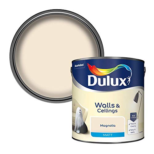
The Jasmine White offer a smoother, creamier solution than the plain white offering we mentioned above. Creams offer a cosy environment, more fitting of a conservatory.
- One coat
- Quick drying
- Water Based
Overall, there are so many elements when deciding what colour to paint conservatory walls. Don’t be afraid to ask for a second opinion if you are unsure, on the flip-side don’t be swayed by others if you feel you have made the right choice.
We don’t all have a designer’s eye and there is absolutely no shame in pinching inspiration from elsewhere. A quick search online can reveal thousands of ideas, even the most talented interior designer needs resources for influence.
Hopefully, you can walk away from this with a clearer head, a solid plan and a trip to the DIY store that doesn’t leave your head spinning!